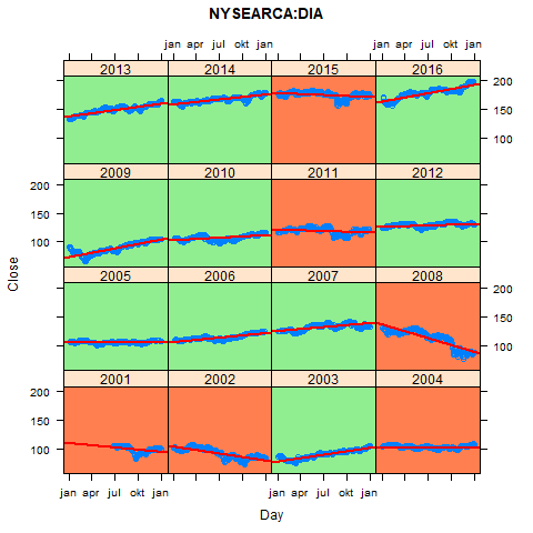
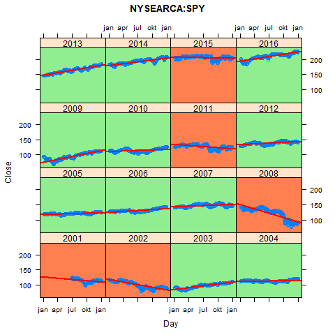
The stock market is down more often than you might think. Beneath I repeat a simply analysis, made in R, of two ETFs on the Dow Jones Industrial Average and S&P 500 respectively. These indexes broadly tell us how the stock market did in a given year. Every red box in the graphs beneath depicts a year in which the trend was downward. And green boxes depict years with an upward trend.
Conclusion: in the period 2001-2016, these indexes have a downward trend in about 1 out of 3 years.


For those interested, the code is on Github.